I learned great lessons today about responsive websites. The first lesson it to use a site such as The Responsinator in order to be able to see your application across multiple platforms. Second, use Twitter Bootstrap. Bootstrap comes with a responsive CSS stylesheet so that as long as you don’t set a height/width for certain elements, your work will just become responsive on its own. The third part is that on some mobile devices, such as the iPhone, the device will have auto zoom-out going for some reason. In order to combat this you need to add the line
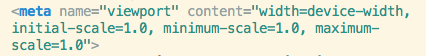
to your application and specifically to your layout file if you are using rails. So rather than your site looking nice but having the iPhone zoom out like crazy, it will look something like this
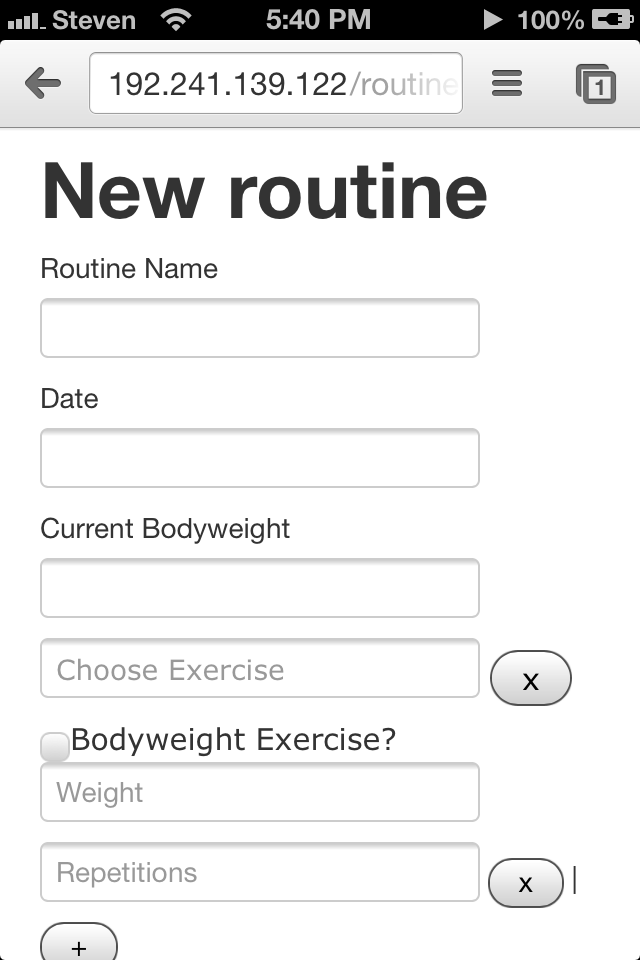
So while Bootstrap is amazing and allows people like me to create responsive sites without actually making them responsive, just remember to add the snippit above to your layout file.